
Admin Frog

Filling out a brand
Client: Admin Frog
Admin Frog approached me to bring a little life to their new business and create an identity that was memorable, trustworthy and stress-free. In a couple of weeks we turned around a simple toolkit packed with character but not overly designed.

We introduced a clear and human serif wordmark in Gelica and accompanied by our visual anchor the form filling frog.
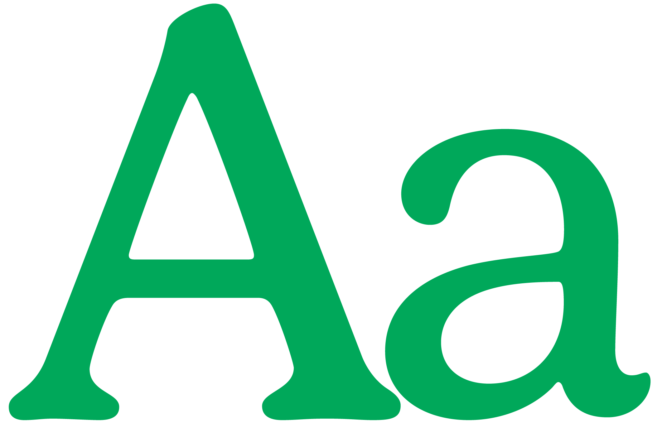
Gelica has these charming bends in the knees and cow-licks on the serifs.
Once paired with Open Sans for readability, the combination provides a balance between the reliable and the personal.


Throughout the branding we created small human moments through illustration that appear sparingly in the identity in two styles - one a more expressive accent style and another simpler style to communicate services.


The whole identity has been designed to be simple to use and easy to engage with.